Planning Aid Scotland
Brand Identity / Printed Materials / Motion
Planning Aid Scotland is an educational charity and outreach organisation that educates and engages people on the planning system, helping them to have licence over changes to the places they live and promoting visibility in the working processes of the sector.
The organisation is built up of architects, planners and volunteers, delivering support via a community education programme and advice line. With a particular focus on areas of deprivation, their shared vision is one of an inclusive society where people are at the heart of decision-making about their places.
Brief
The organisation needed a contemporary brand that helped dispel the idea of the planning system as gatekept and outdated. Imagery was to reference recognisable elements of planning in a playful nod to their area of expertise.
It was key for their expertise to be communicated whilst remaining approachable to newcomers needing assistance. We focused on finding balance between the needs of industry professionals, governments and community members.


Challenges
The workshop process revealed the name as a barrier to the organisation’s goals - although referred to as PAS within the sector, the abbreviation didn't mean anything to the newer audiences they were trying to reach. However, with 30 years experience behind them, we had to find a way to build on their experience to date, rather than changing direction entirely.


Solution
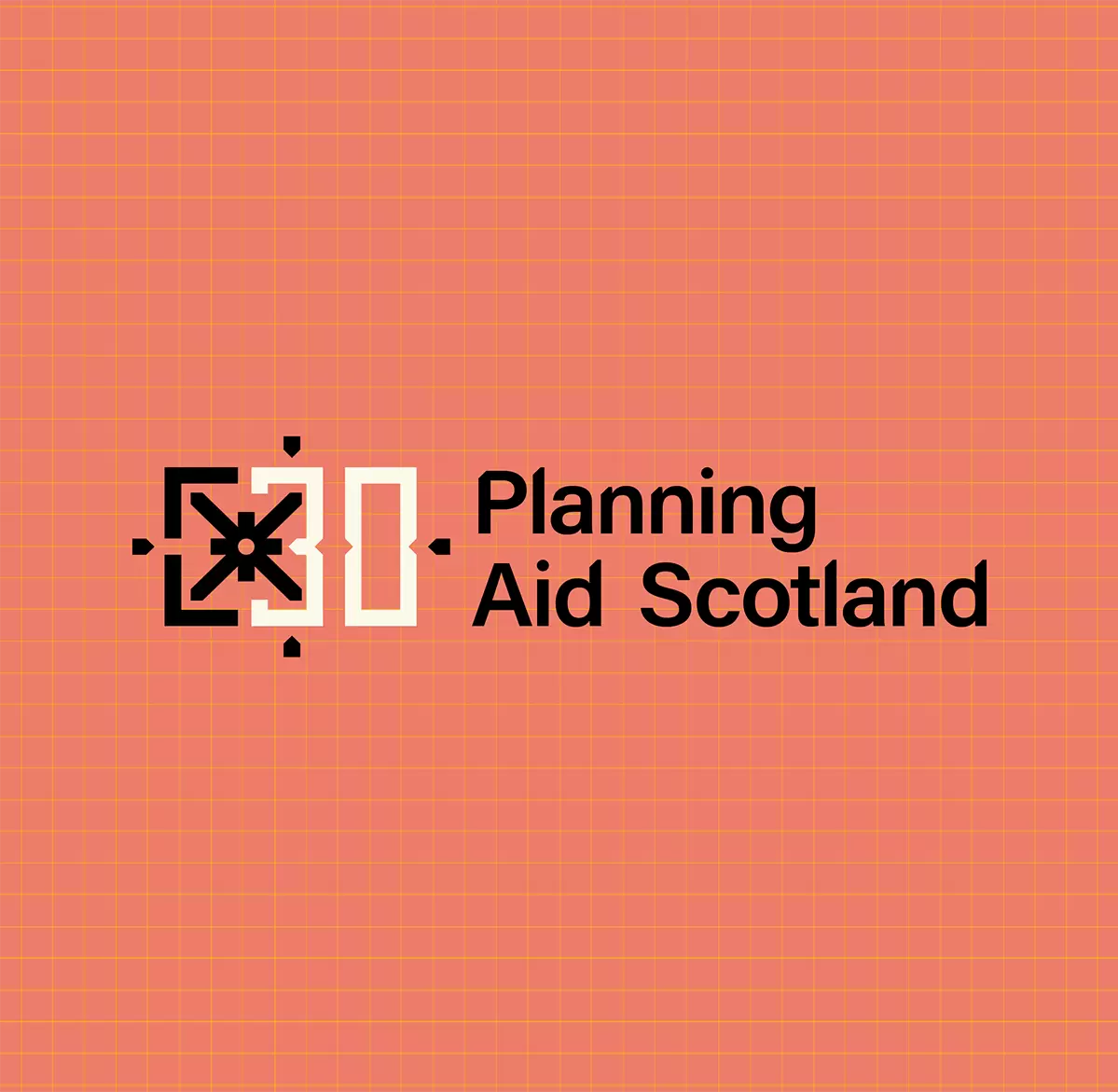
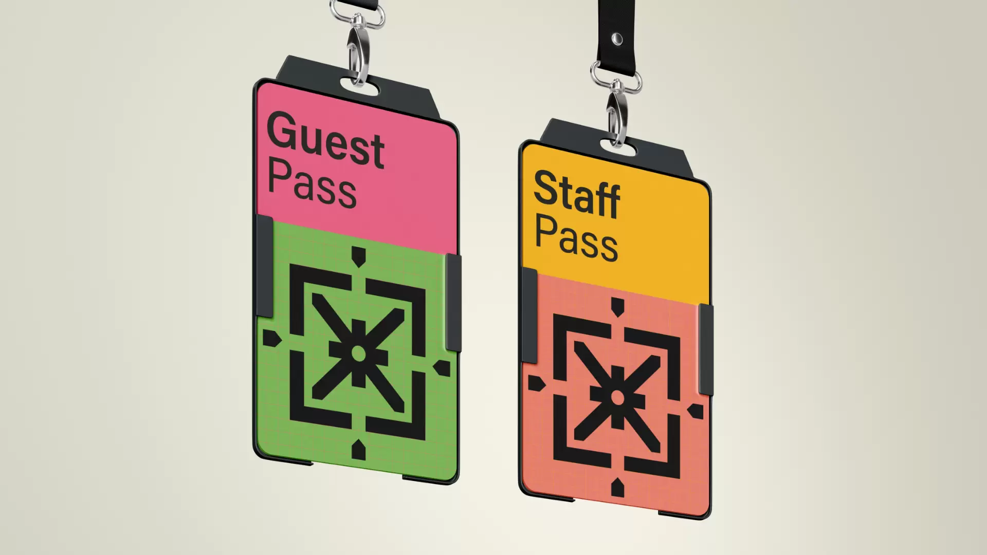
Throughout the brand materials, we implemented the full name of the organisation rather than the initials. By doing so, Planning Aid Scotland became more visible to people outside of the sector. We created a logo system that is structured and technical, referencing the work that Planning Aid Scotland does by drawing on elements of their practice as well as their history.
The logo is made up of three key elements that relate directly to the name - the graphical shape citing technical drawings for planning, the cross being the universal symbol for aid and the saltire representing Scotland, in reference to the organisation's previous logo.
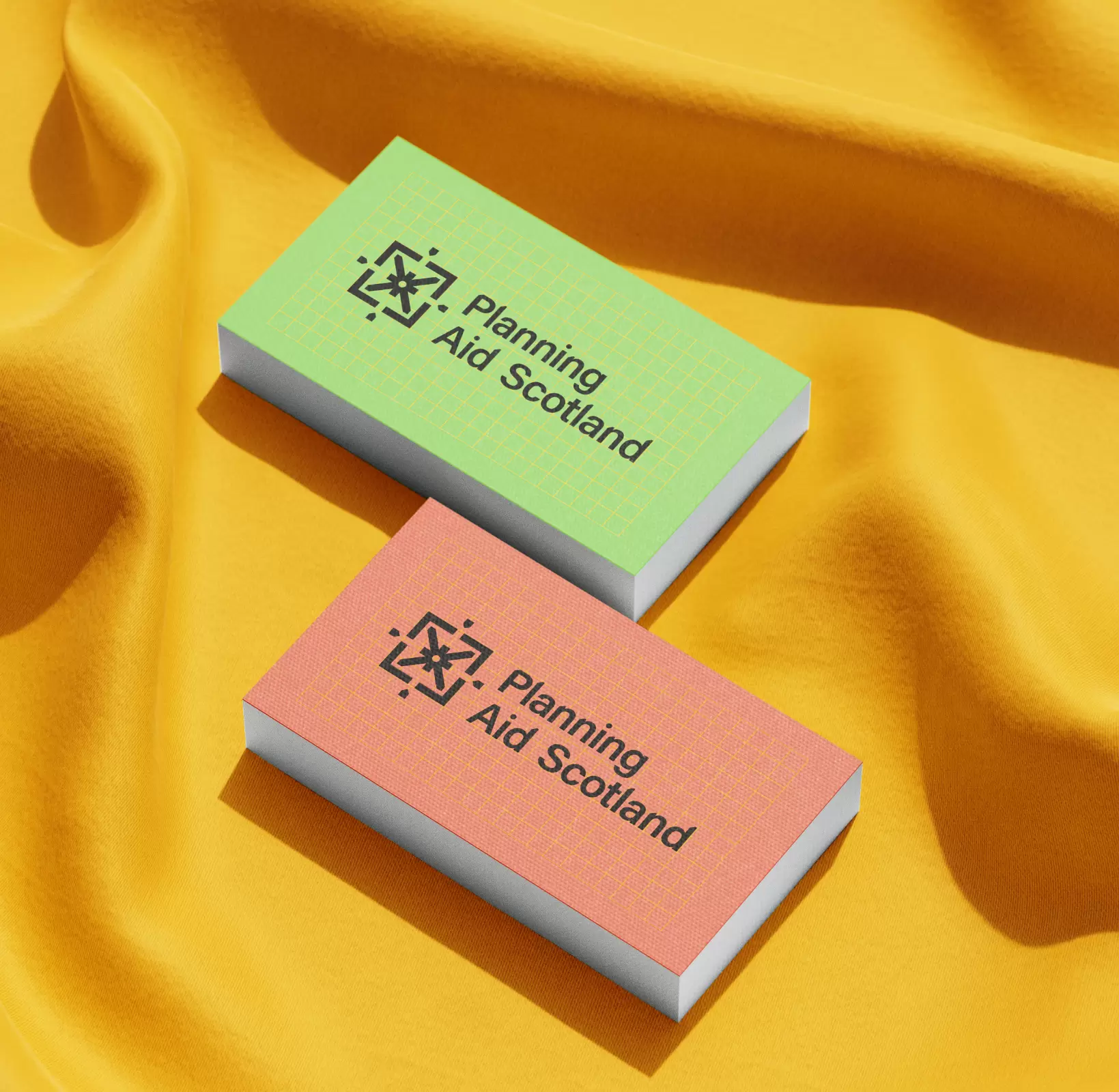
Whilst the brand is built on technical references, the colour palette and grid pattern juxtaposes this, cementing the balance between approachable and professional. We adjusted elements of the logotype to correspond with the logomark, ensuring brand cohesiveness throughout.


Impact
We equipped Planning Aid Scotland with a brand system that will support them to achieve their aspirations for the future, empowering more people to engage with the topics and decisions that affect their lives by representing the organisation as welcoming, modern and positive. The brand has since been rolled out across their website, with a series of events to mark the organisation’s 30th year planned for 2024.

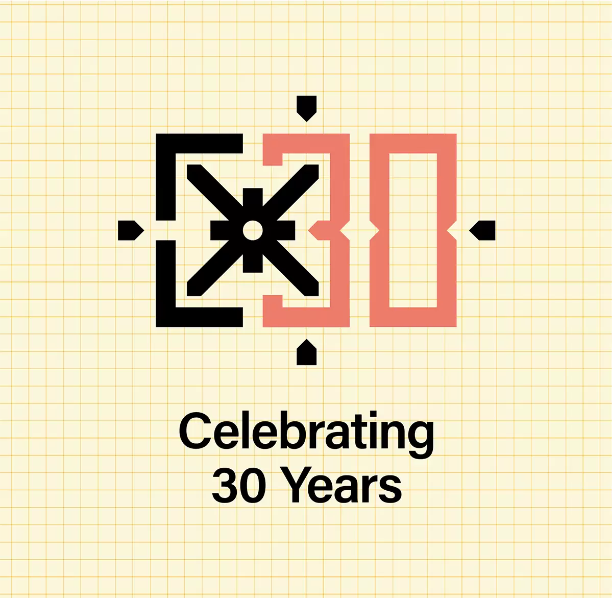
Celebrating 30 years
We were working with Planning Aid Scotland in the lead up to their 30th Anniversary. In light of this, we created an additional numerical system that would allow them to celebrate the milestone. The contrasting colours between the numerical elements and the logomark highlights the importance of their years in practice so far, whilst also alluding to their renewed approach to work going forward.